Tree Testing
First Round Results
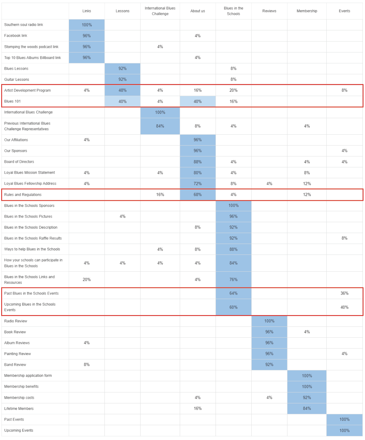
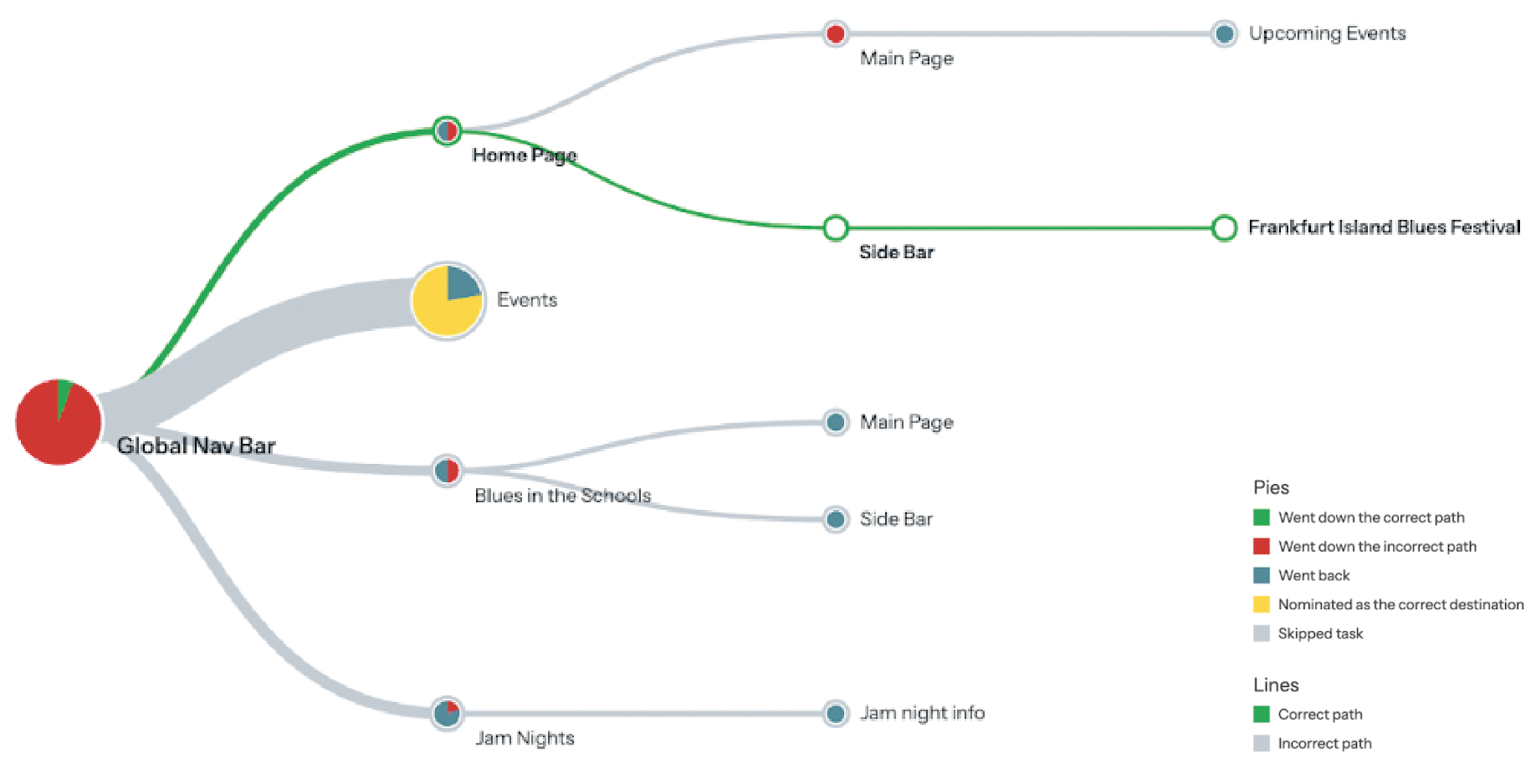
The initial tree test used the current Loyal Blues website's information architecture (IA) to assess how easily users could find key information. Participants were tasked with finding blues lessons and locating an upcoming event (Frankfurt Blues Festival). The results highlighted severe navigation issues: the overall success rate was 31%, and the directness rate was 40%, indicating that users often took incorrect paths before finding—or failing to find—the correct page. Completion times were long, signalling frustration and difficulty understanding the IA.
Task 1: Finding Blues Lessons
Only 2 of 21 participants (10%) succeeded. Users mistakenly assumed "Blues in the Schools" contained lessons, and many expected lessons to be under "Jam Nights," which was incorrect.
Task 2: Finding the Frankfurt Blues Festival
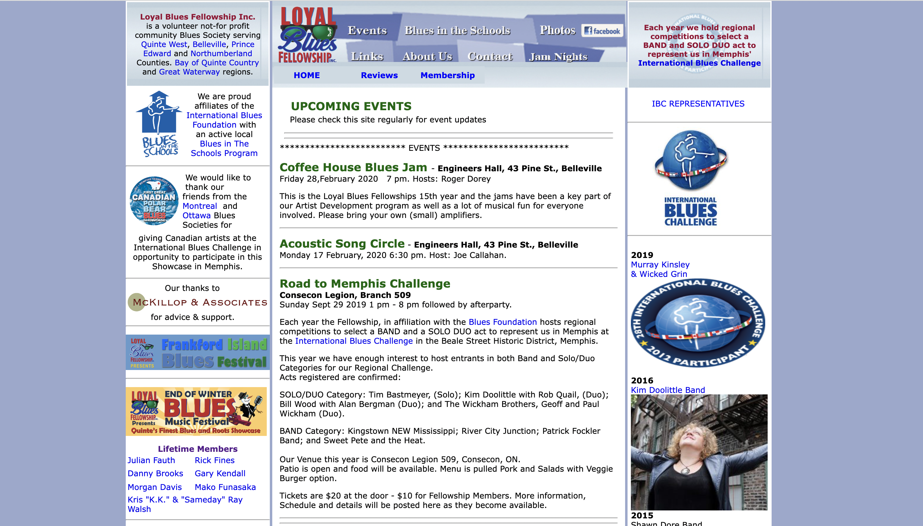
No participants succeeded. 95% clicked on "Events," assuming festivals would be listed there, but the correct path was under "Home" and buried in a sidebar, which users did not expect.
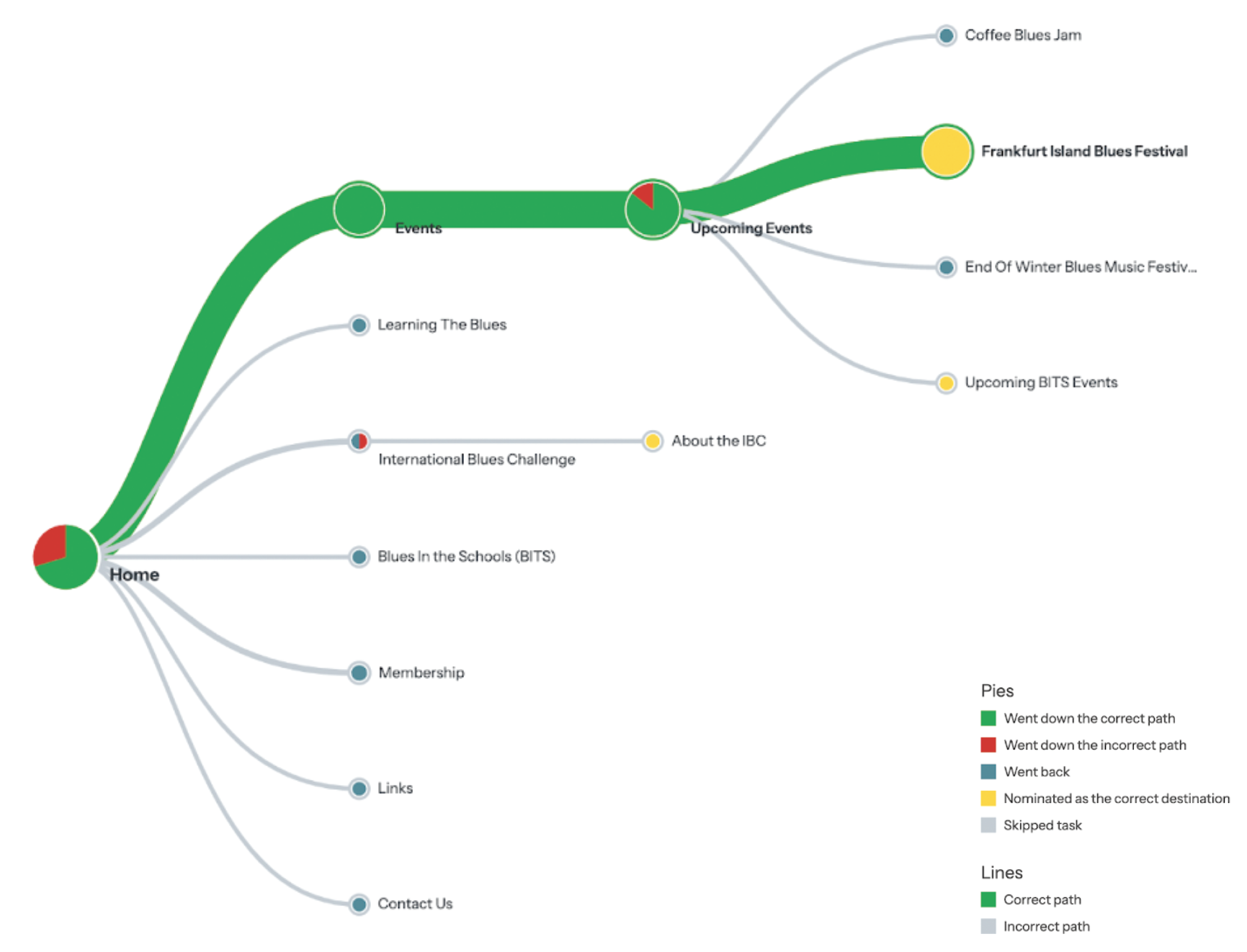
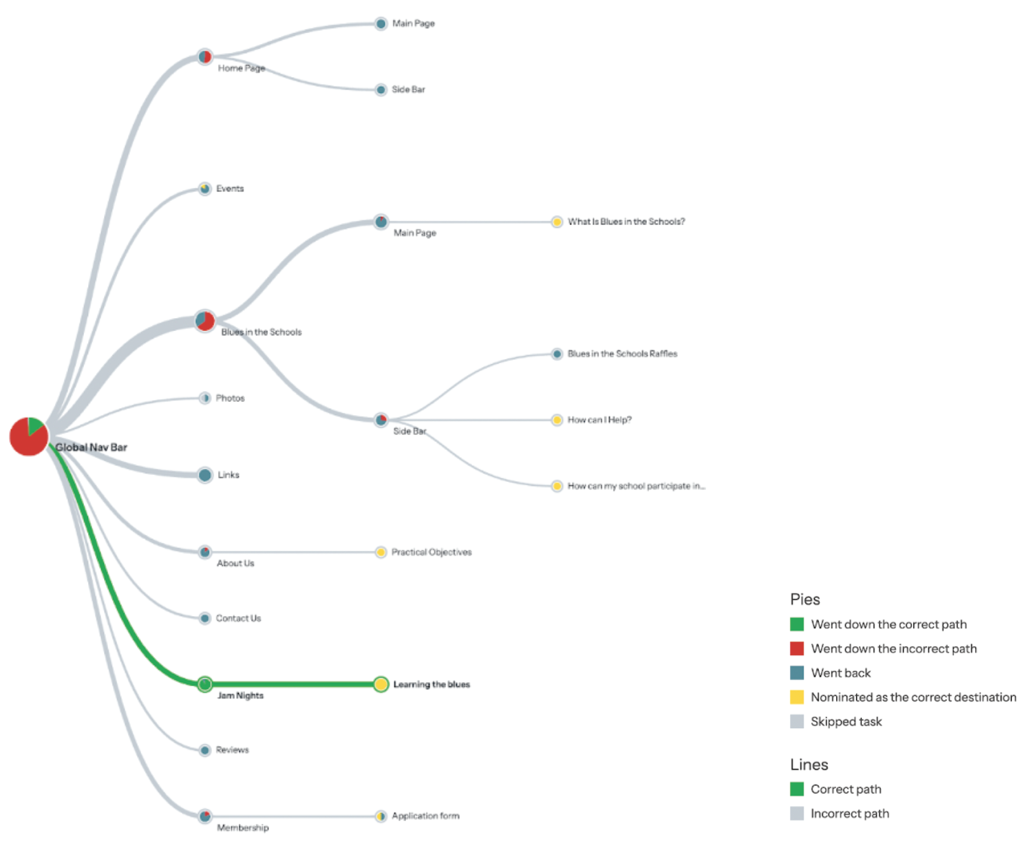
Second Round Results
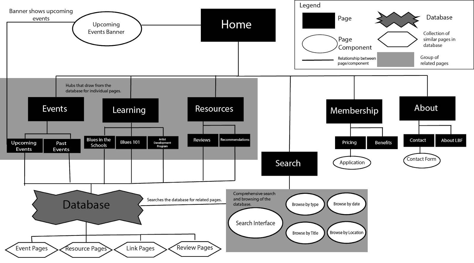
After restructuring the IA, we conducted a second tree test to assess improvements. The results showed a significant boost in usability: the overall success rate increased from 31% to 88%, and the directness rate jumped from 40% to 80%, indicating users followed the correct path more often. Task completion times decreased, suggesting easier navigation.
Task 1: Finding Blues Lessons
Saw a success rate of 85% (up from 10%), with users confidently selecting "Learning the Blues" due to improved labeling, without needing to backtrack.
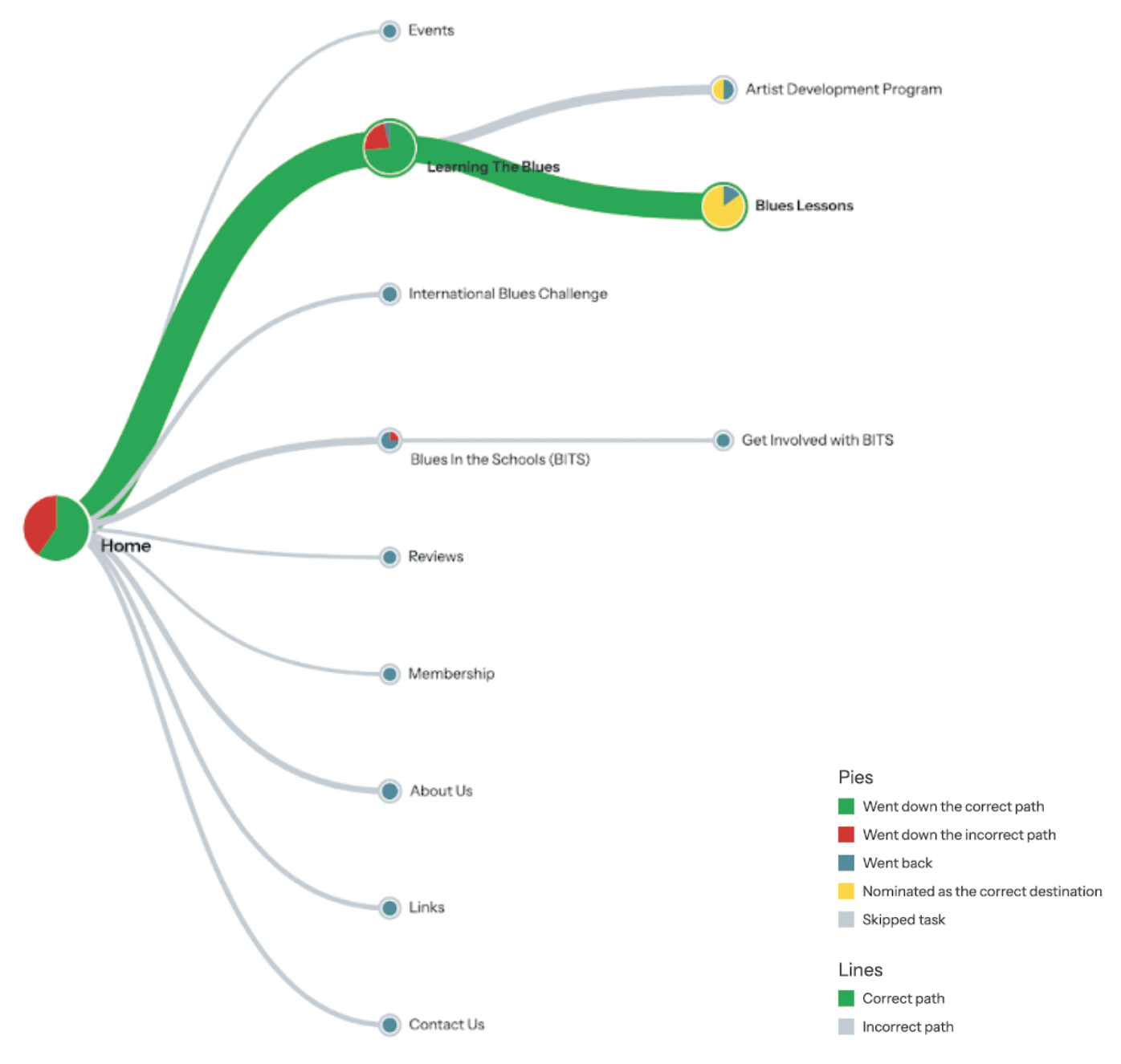
Task 2: Finding the Frankfurt Blues Festival
Had a success rate of 88% (up from 0%), with 80% of participants finding the correct path on the first click and no one misclicking into the wrong categories.